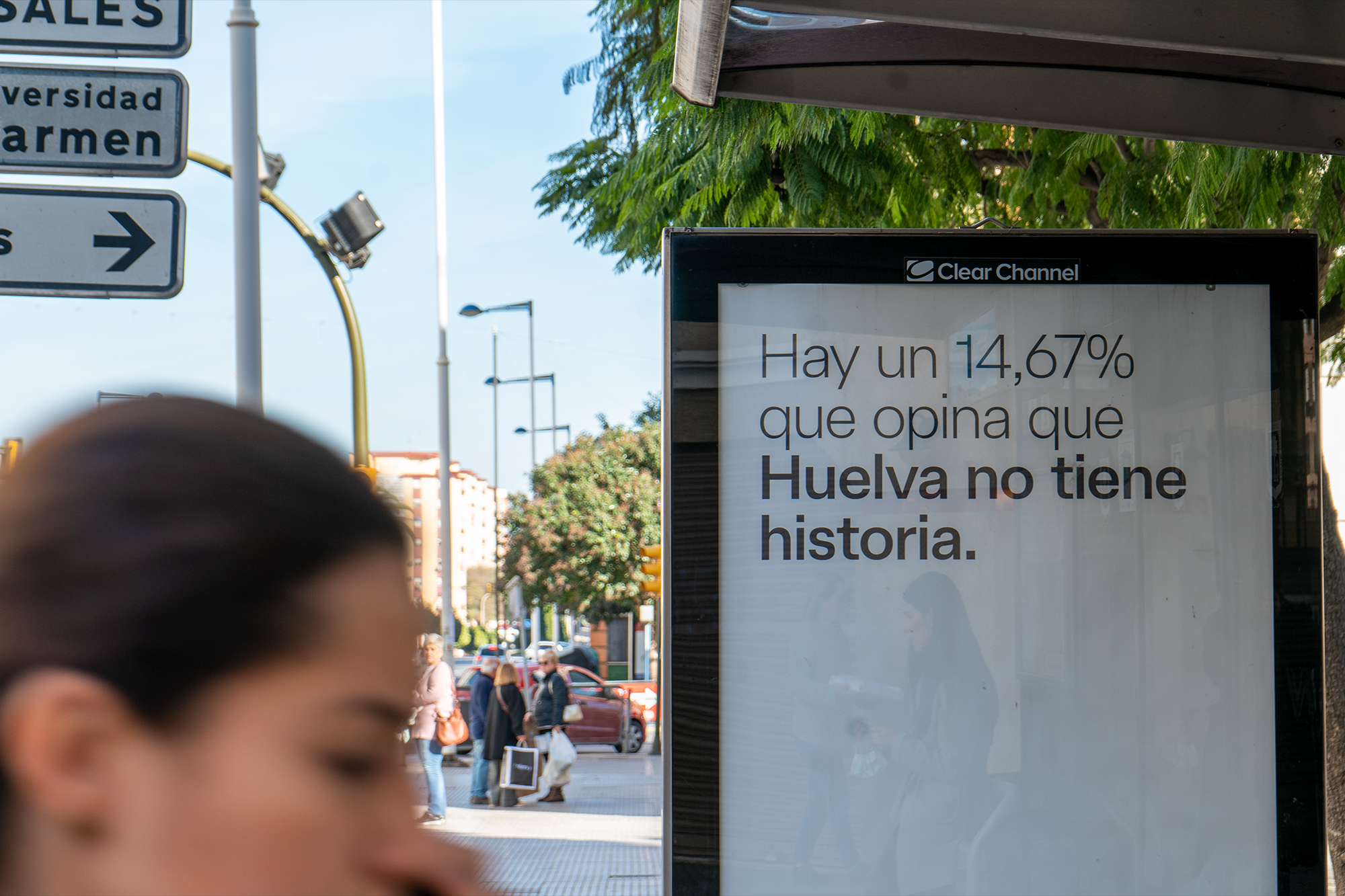
The innovative spirit of Huelva throughout history has shaped the identity of the city, endowing it with a unique pioneering character. The new city brand of Huelva is called upon to project and showcase its history and heritage, as well as the achievements and benefits it brings to the city, creating a storytelling narrative capable of addressing Huelva’s diversity and developing an original positioning that relocates it in the minds of those who live in it and on the global map.
Huelva original
The city thus establishes a close relationship with firsts, being a pioneer in paving the way in numerous fields and moments throughout history, which has made it a place of origin. Thus, if Huelva is the origin par excellence, Huelva is the original city; not only by virtue of birth, beginning, or root, but also due to its innovative capacity and uniqueness. Huelva, the authentic, the only one, the capital, the original.
For the new city brand of Huelva, forging new paths is the way to find itself, and authenticity is its most cherished value. “Huelva original” thus becomes the main claim of the new brand, based on which the entire verbal universe will be developed to requalify as “originals of Huelva” those places, moments, and people linked to the capital of Huelva in any of its forms, contributing singularity and authenticity. It is not only about recognizing the city’s unique character, but also discovering its full potential in fields linked to creation, innovation, or science, as this will not only generate pride but also instill confidence in what Huelva, as a city, has been and is capable of doing from an active standpoint.
The Huelva flag as a generative symbol
Drawing from one of the most recognizable identity elements of the city by the people of Huelva, such as the Huelva flag, and considering its previous development and use by the municipal institution, the new brand inherits this symbol, evolving it to generate a flexible and dynamic visual system. Thus, starting from the square as the minimum element, the identity unfolds through a symbol called to qualify as “original from Huelva” in all graphic applications, campaigns, and actions where the new brand is present.
A brand born from the citizens
The new Huelva brand emerges from a collaborative search for its symbolic identity, laying its foundations in the involvement of over 1,200 citizens of Huelva who have actively participated in the development of a shared city narrative.
This process has engaged individuals from the business world and economic revitalization of the city, various public opinion agents, culture and cultural management, from avant-garde to traditions, sports, urban model, archaeology and urban planning, tourism, knowledge and education, or commerce, as well as different local ambassadors, both anonymous and recognized personalities from Huelva in various fields.
Thus, the new Huelva brand is nourished by the everyday life of the city, respecting the past, looking to the future, and portraying the present. A brand that gathers memories and experiences from daily life through its ambassadors, creating and sharing a collective consciousness of what Huelva represents.
Onuba Type, an “original” typeface
The new Huelva city brand has developed its own typeface, Onuba Type, which arises from the brand symbol, the square of the Huelva flag, to generate an “original” alphabet.
Based on mid-20th-century neo-grotesque typefaces, Onuba Type gives rise to glyphs that formally could be linked to Tartessian times, although its development is adapted to current aesthetics and needs. It is an elegant and unique typeface, with a solid and balanced structure, allowing for flexible and effective communication. Onuba is available in two weights, Light and Regular, both optimized for print and digital environments.
Expert typographer Pedro Arilla was consulted for the typographic development through the initial concept and its proper licensing. A typeface distinguished by a series of special characters, vowels, and punctuation marks that reclaim the identity of the people of Huelva, their gathering places, and customs through their peculiar “a”.
The colors of the sunniest city
The chromatic palette of the new Huelva brand originates from the emotional descriptions provided by a vast majority of Huelva residents through the co-creation process surveys. They highlight the unique colors offered by the sunsets in the city, overlooking its estuary and views of the Odiel Marshes Natural Park.
Incorporating the city’s green dimension allows for the expansion of a chromatic range that, while inheriting the predominant use of blue, demonstrates versatility to adapt to different environments and ecosystems. It aims to evolve and transform over time, ensuring its longevity.
A distinctive sound imagery
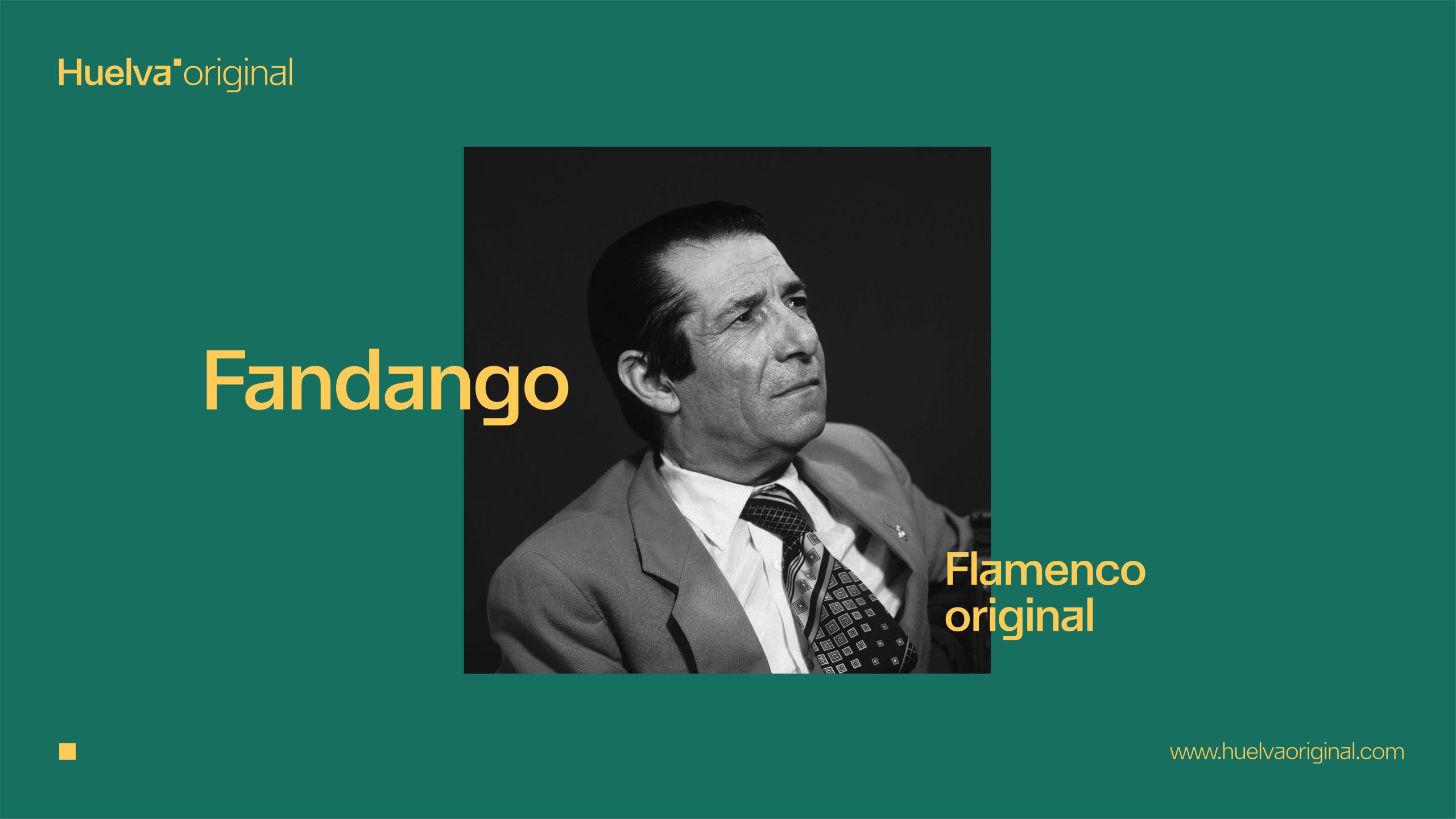
What does Huelva sound like? This question was posed to the citizens. The sounds of the sea, the waves, the fandango, the bustling of people, clapping and laughter, bells and guitar, breeze and birds, drums and turbines, tradition and modernity converge in a cutting-edge piece created by the local artist Pirámida. A musical cut of refined electronics, which accompanies the events and promotional activities of the brand and adds another dimension to the tangible and intangible identity of the city.
The voice narrating the brand launch videos also bears a marked Huelva character thanks to the recognizable diction of Rocío Márquez, an internationally renowned singer and representative of the most “original” flamenco.